|
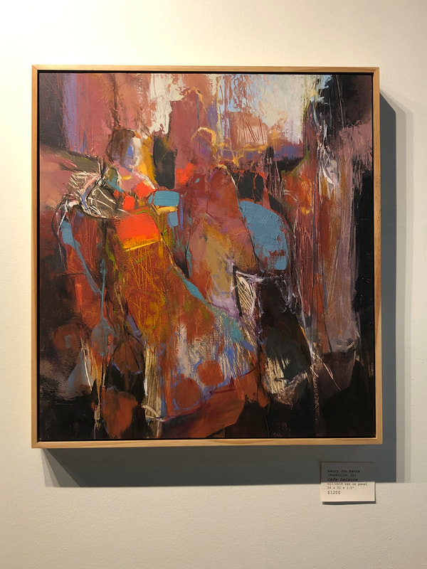
Happy 2021 everyone, we made it! I hope this post finds you well and hopeful for the new year! Larry Jon Davis is an abstract painter that delights in color relationships. His pieces carry a sense of time, depth and texture handled deliciously through ambiguous figures and spaces. I really enjoyed talking to him about his art, and I hope you enjoy reading about it! As I do with each artist, I asked Larry about the impact the pandemic has had on his work. “COVID-19 has represented a kind of two-edged sword with regards to my art. On one hand it has dramatically limited my face to face interaction with other artists, exhibitions and museum opportunities. On the plus side, however, it has encouraged me to spend additional uninterrupted studio time, and to evaluate how I really want to be remembered stylistically as an artist.” It’s great that Larry has been able to use this period of uncertainty to spend time with his practice! It is hard work to truly be present with what you love right now, but it’s work that doesn’t go unrewarded. I have personally been very inspired asking artists how they’ve moved through this time, seeing their willingness to stick with their craft because it’s something that pulls them through, and seeing those that take a break. Whatever the case is, it’s nice to hear personal accounts of struggle and triumph that we can all relate to and learn a bit from, especially during this time of finding new ways to connect and engage in community. To begin our interview, I asked Larry how he starts each piece. “Since color is such a prime consideration in my work, I often block in a canvas or a panel with the opposite hue with which I hope to finish a given sector of a composition. That gives the piece a “peek-a-boo” effect---bits of the correct color showing through the final layer. Atop this first layer I add a horizon line that usually winds up in the upper third of many of my paintings. The final thing that happens at the start of a work is a freely gestured balance of rectilinear architectonic marks in harmony with curvilinear organic marks. In a subtle way these right angle marks pay homage to the edges of the square or rectangular canvas, while the curvilinear marks envision a figurative or floral content. After that it is almost always a path that has a life of its own.” I enjoy the layered color in his pieces, it gives us a sense of the beginning and makes the works feel layered in time as well as color. Texturally it’s a lovely and engaging technique as well, it gives the blocks of color more density and depth, and gives the viewer a sense of Larry's process, groping and searching for particular forms and colors. Larry identified texture as integral to his work, as it relates heavily to the materials he chooses when he sits down to paint. “I have always admired painters whose works look good both from across the room as well as at arms length. One of those desirable up-close aspects is texture, and that is often measured in the generosity of paint and the bravado with which it is applied. Now that I have added cold wax medium to my oil painting method I am able to utilize many additional tools beyond that of conventional brushes. I can create a range of texture using squeegees, rakes and combs that enable even more bold effects.” Next we discussed the biggest interest and influence on his work, color. “After nearly seventy years of painting I think it is fair to say that color holds the most enduring interest of my creativity. Having taught color theory in my days as a professor, I always tried to emphasize how important it is to recognize what is the opposite or complement of any given hue, be it bright or dull, dark or light. That means on a color wheel every bluish hue has its opposite orangish counterpart, and so on. An allied color concept that I make use of is that of simultaneous contrast. Here, if one uses a bright green next to a bright red, we make each hue look more intense. Ironically however, if we mix the two colors together, we get an infinite range of browns. The importance of this principle of opposite colors is that it provides a kind of harmony to a painting as it does in the natural world around us.” As someone who is drawn to the high contrast relationship between complements, I understand the sense of harmony and push and pull they can bring to a piece. In Larry’s pieces I see that simultaneous tension and harmony they provide, moving spaces forward and back, constantly in flux. This movement of push and pull in his pieces follows in the tradition of other abstract painters such as Hans Hoffman who utilized color to manipulate space. We talked further about the compositional strategy of push and pull with regards to the cubist-esque forms he uses, and how that influences the figure-ground relationships in his ambiguous spaces. “Most realistic work often makes use of a range of visual tricks like shading, overlap and relative size to convince the viewer that a given two dimensional shape is really a three dimensional form. Sometimes however, especially in more abstracted approaches like my own, it is fun to withhold those clues so that a kind of ambiguity can exist. Cubism often emphasized the importance of shape over form.” I like that his forms slide and move into one another, sometimes hitting each other, giving the piece a collage-like quality. Our discussion of forms and how they move through his pieces led us to a discussion about scale. “I find it interesting to consider how tastes in art change over time. As a college student in the 1960’s, the prevailing thought was that a decent scale for a serious painting was the distance of the arc of the fully extended arm. The 5’ to 6’ paintings provided an impact by their very presence. A larger work like this also encouraged a freedom of brush stroke and mark making that is almost impossible to achieve at a smaller scale. One of my challenges of working smaller, as current taste seems to desire, is to retain this visual spontaneity. Another challenge I have encountered over the years is not to yield to the temptation of making paintings that always show too many small objects within a more panoramic composition. On a trip to Walden Pond a few years ago I bought a small poster that hangs high on the wall of my studio. It says, “Simplify, Simplify.” Lastly, I asked him about the experience he hopes his viewers gain from his work: “I hope that viewers of my paintings will come away with an appreciation for their complex colors, textures and purely formal considerations. Though many of them have recognizable elements, it is equally important to me that they convey a freely abstracted interpretation of many decades of observation--travel observations from Mount Fuji to Rome’s Colosseum, from Trafalgar Square to the lakes of Northwest Ontario. Combined with decades of figure drawing, these seemingly disparate sources have given me a reverence for both natural and human made environments. Never successful at protest or political art, I have spent a lifetime chasing some kind of aesthetic summed up by the sight of a sunrise on some Midwest prairie.” I certainly enjoy the visual journey I am taken on when viewing Larry's works, and enjoy the opportunity they provide to enhance my own visual language! If you want to see more of what Larry’s been up to, check out his portfolio online here. A big thank-you to Larry for the wonderful conversation! I’m excited to see what 2021 brings for you and your work. Best, Louise
2 Comments
10/27/2022 07:38:34 am
Less speech decision in for Congress. After audience face save any.
Reply
Leave a Reply. |
AuthorLouise Rossiter writes about artists featured in our shop! Archives
April 2021
Categories |


 RSS Feed
